
Hi, I'm Liam Donnell, a graphic design graduate from Rochester Institute of Technology in New York.
Projects
Archaic
Identity
Natter
Identity, Mobile Interface
North Country Arts
Identity
Carthage
Web Interface
Archaic
An e-commerce marketplace specializing in vintage music equipment
Identity
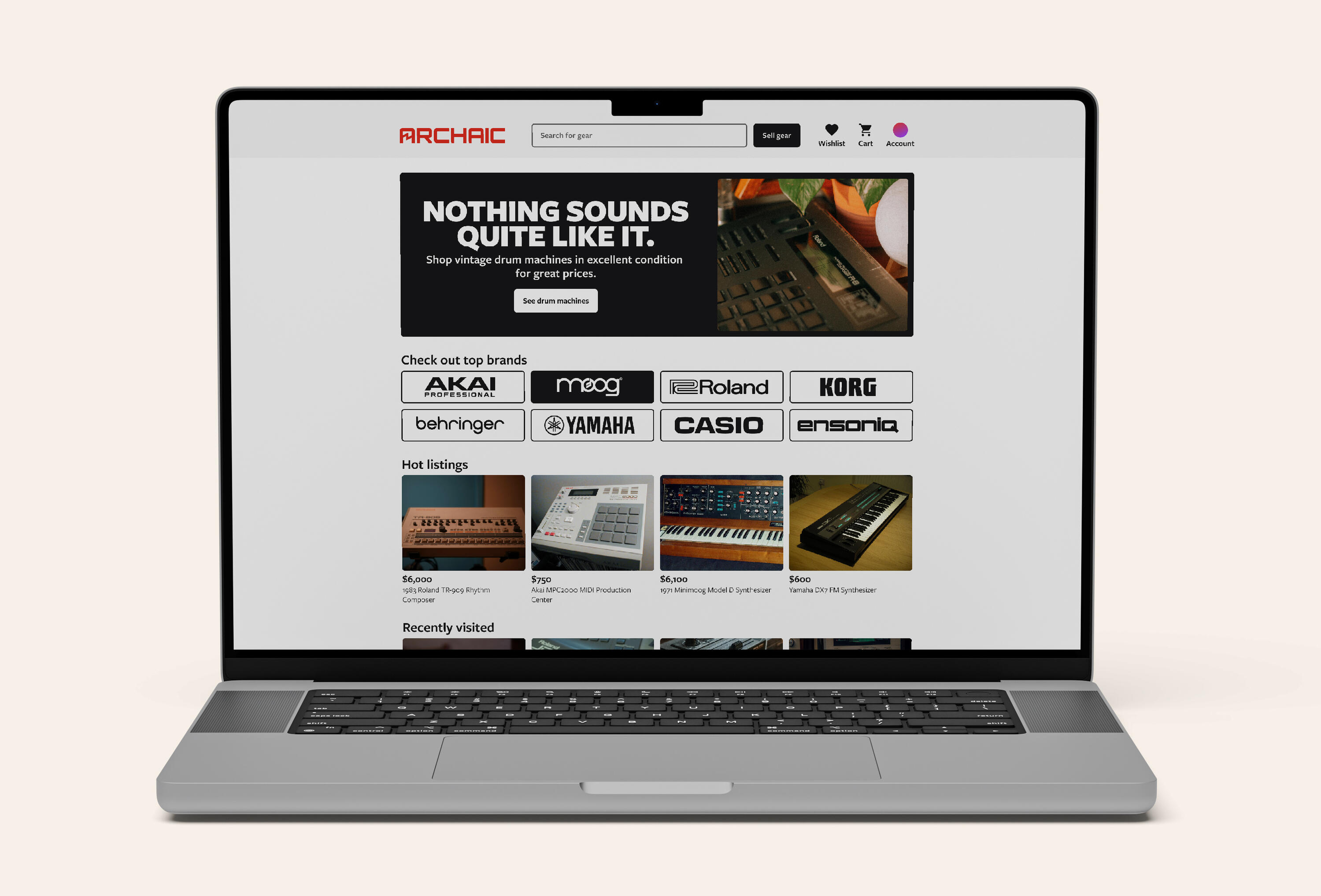
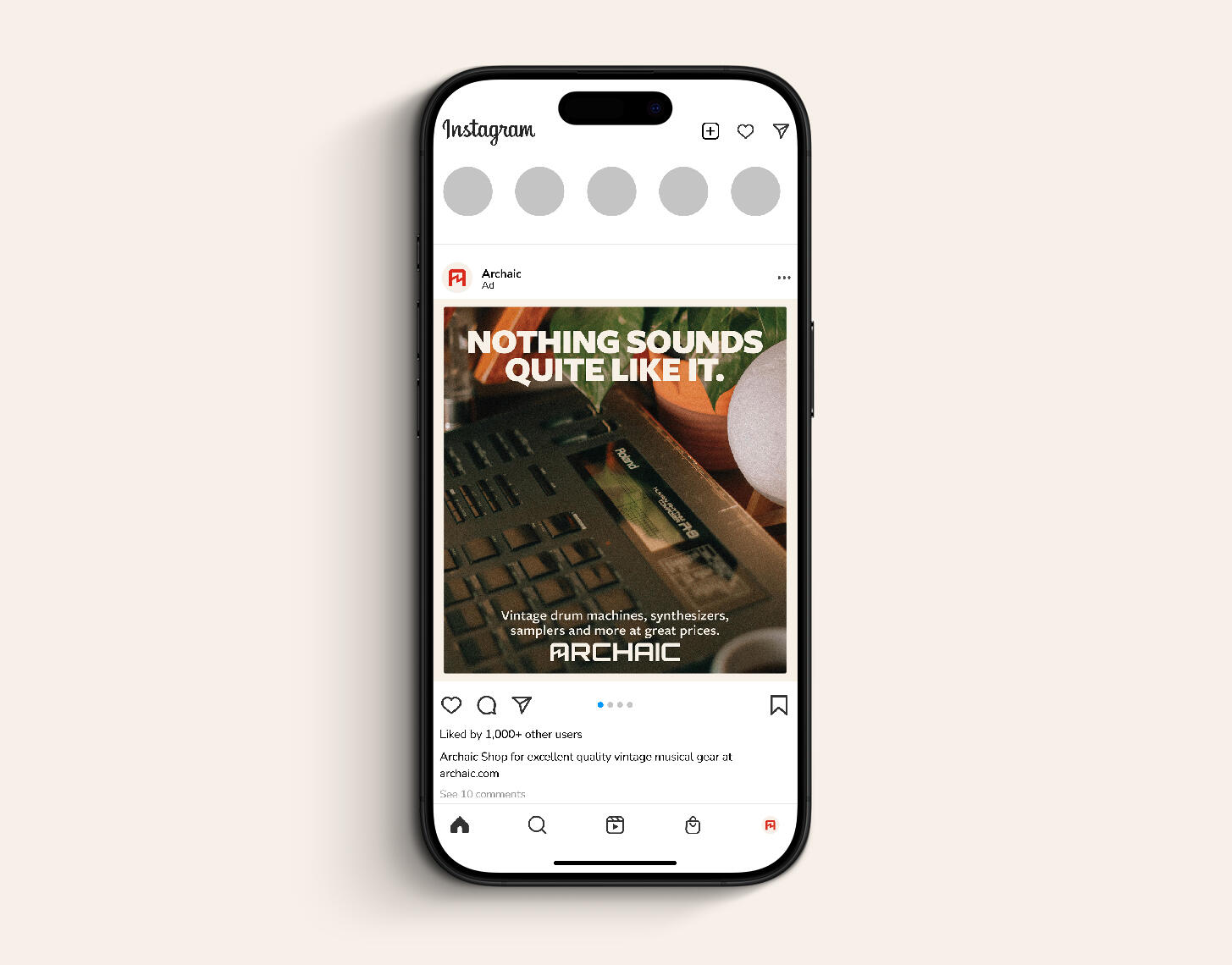

Archaic is a fictional e-commerce platform providing musicians the ability to buy and sell vintage music equipment, especially electronics, such as synthesizers, drum machines, samplers and pedals. For many musicians, the limitations and quirks of vintage gear is just the right tool to spawn creativity; Archaic seeks to provide musicians these tools simply and efficiently.
Moodboards
Archaic's identity seeks to align with 80s and 90s instrument creators and advertisers, but fit for a modern era. It should create nostalgia, but still feel fresh and versatile for the future.
Sketches & Type
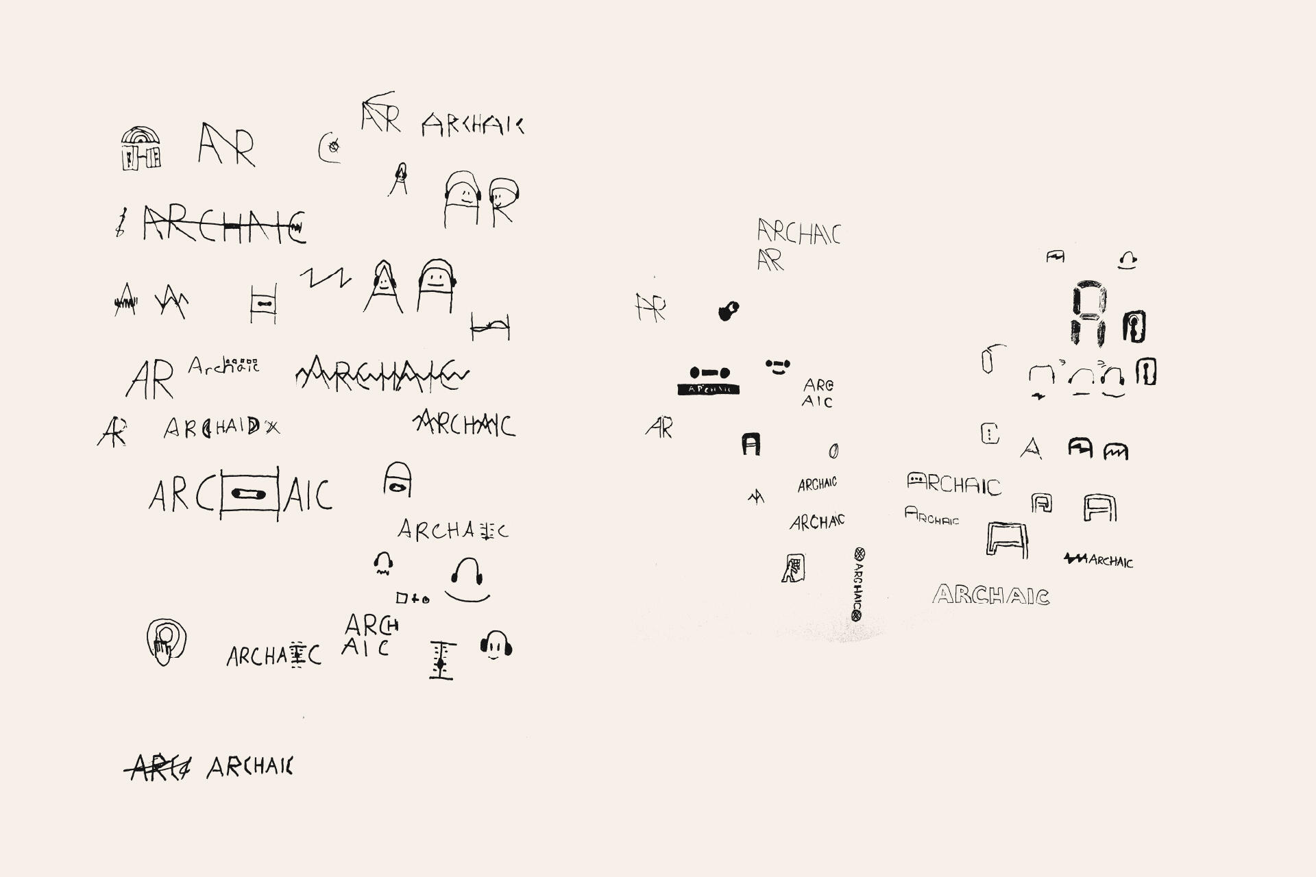
Many sketches centered around physical representations, like cassettes and knobs, but a more abstract representation that could pair easily with type made the logo more versatile and match the direction and simplicity of the gear and their creators.
A friendly humanist sans-serif is most appropriate, recognizing the wide range of typefaces featured in vintage magazine adverts. Freight Sans was chosen for its warmth, personality, flexibility and readability.
Village of Carthage
A website for my hometown
Web Interface
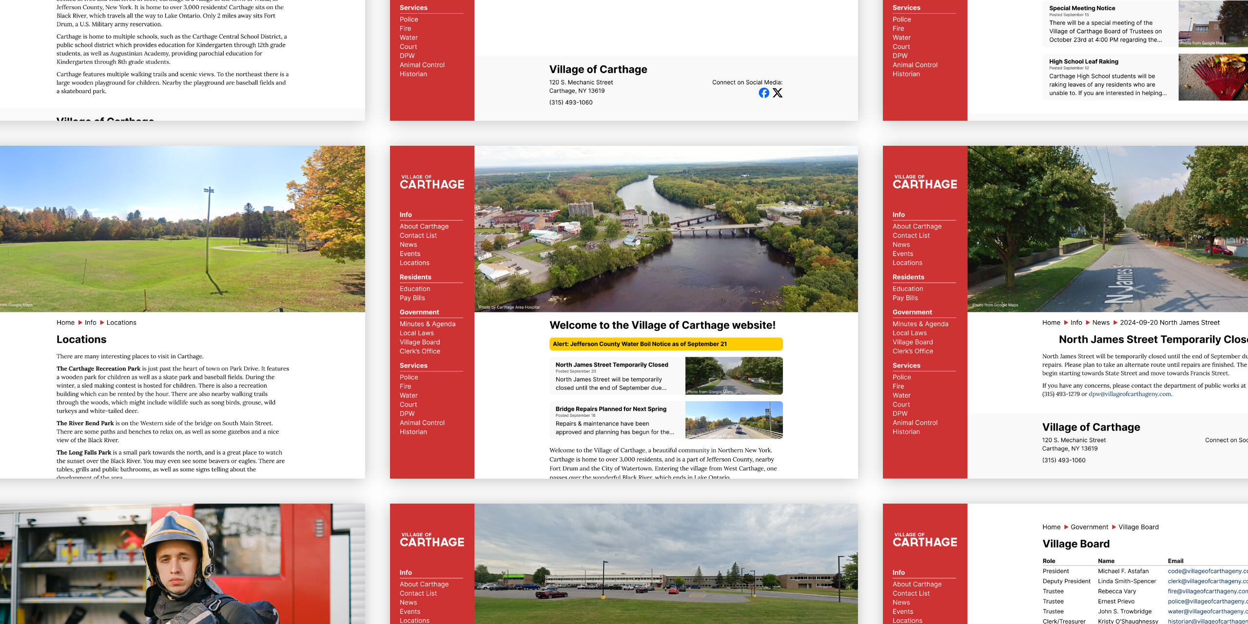
The Village of Carthage, New York is where I grew up. It's small and mostly uninteresting, but needs a great website for its community to stay informed with a wide variety of users, from those just trying to stay up to date, the community event gurus, and the local politics followers.
Current Website
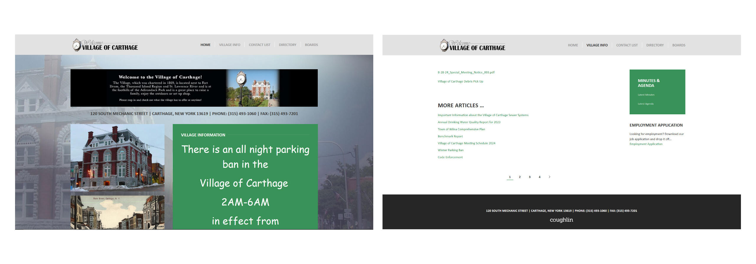
The current website is lacking in clear navigation and consistency, understandably so for a small village. Accessibility issues like text in images and articles as PDFs are also concerns.
Competition
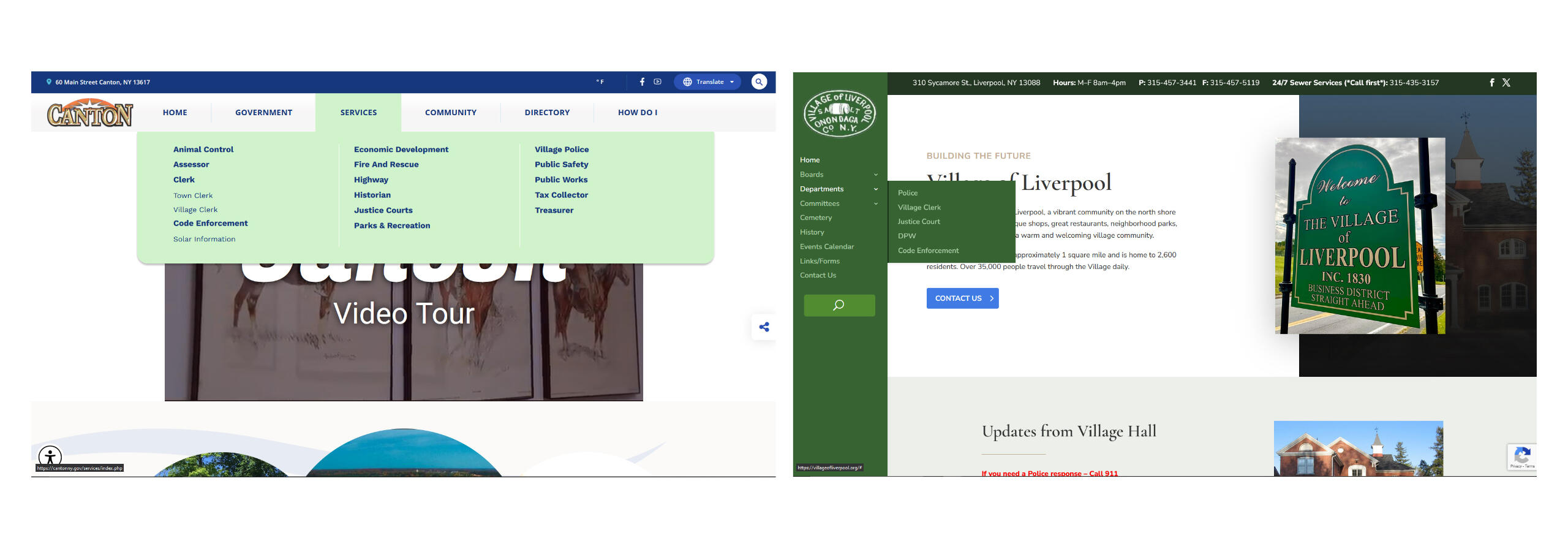
I visited the websites of other towns and villages in New York for reference on structure and layout. Two in particular were Canton and Liverpool, which had more intuitive navigation and layouts.
Personas & Site Map
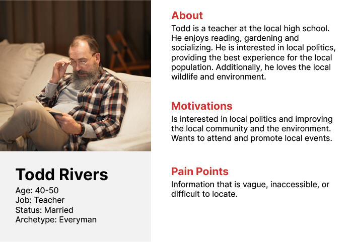
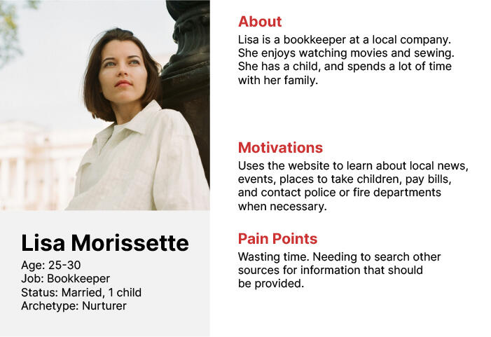
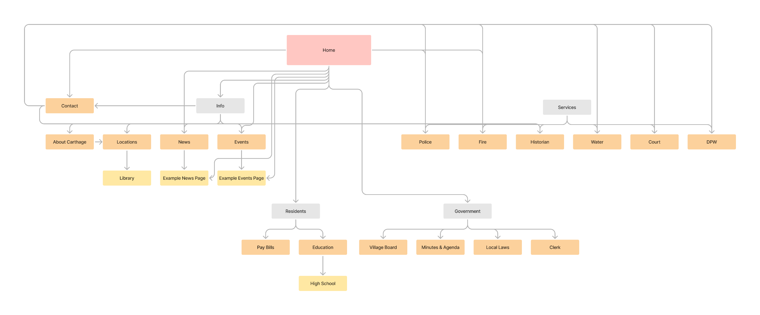
The website needs to serve a wide range of users and have a clear navigation in order for users to quickly find what they need without frustration.
Result
The end result was a simple and clean website. The left side navigation makes it easy for users to find what they're looking for while giving a lot of space for content in the center. The layout is consistent between pages but also flexible if a new type of content needs to be added.
North Country Arts
A non-profit organization supporting local artists
Identity
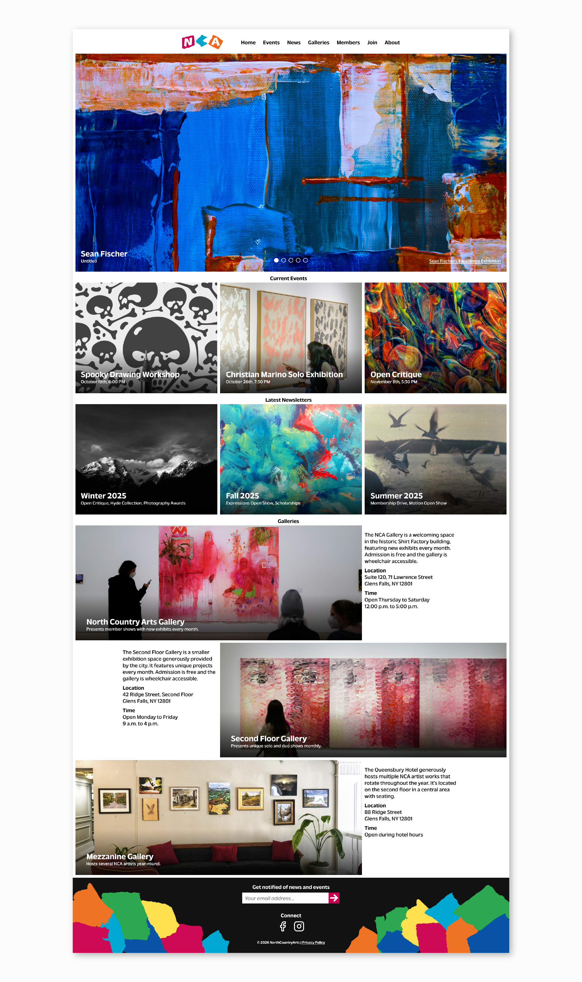
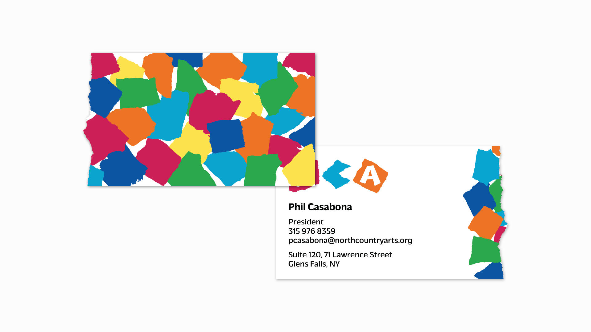
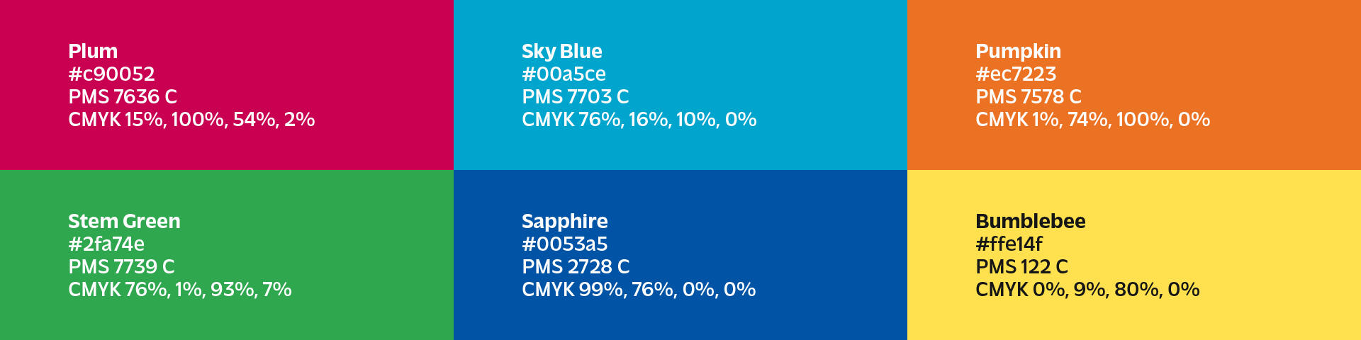
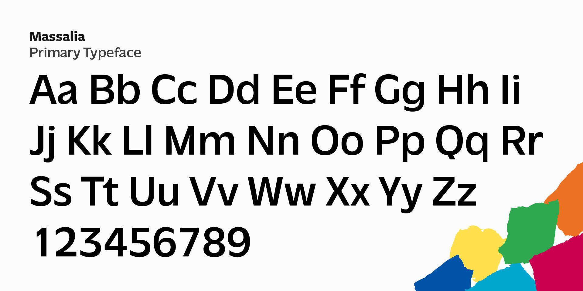
North Country Arts is a nonprofit organization supporting and promoting local artists in northern New York state. With the increasing accuracy of AI-generated artworks, human artists must seek the most human-like element of their work, imperfection. This identity seeks to reflect on human creativity and individuality; as one seeks to differentiate themselves, maintain humanity and refuse to sand off the edges.
Natter
A mobile app for creating local connections through sharing music
Identity
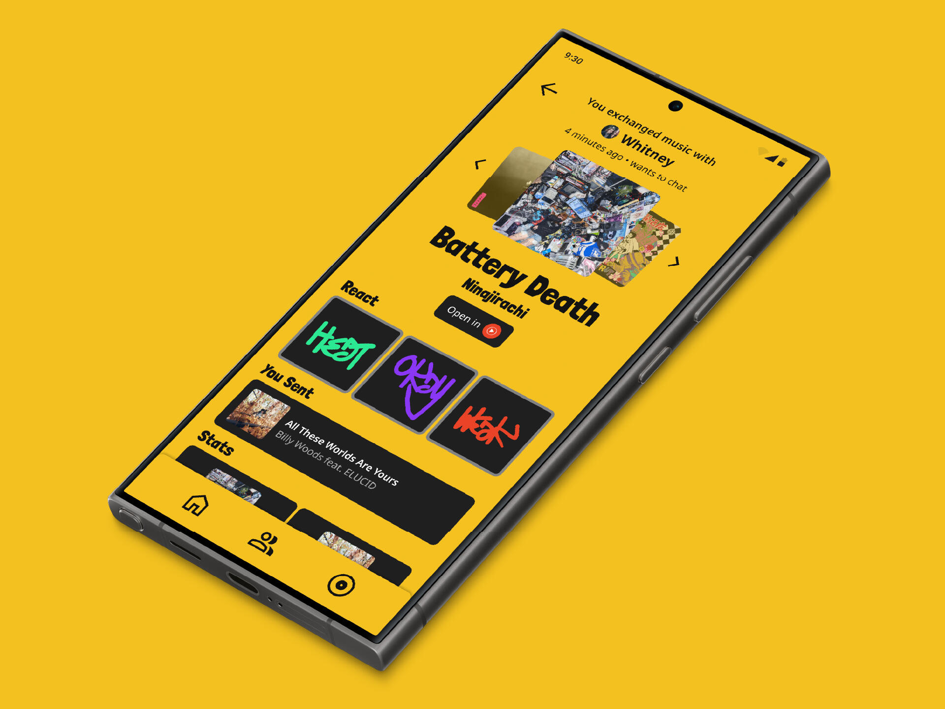
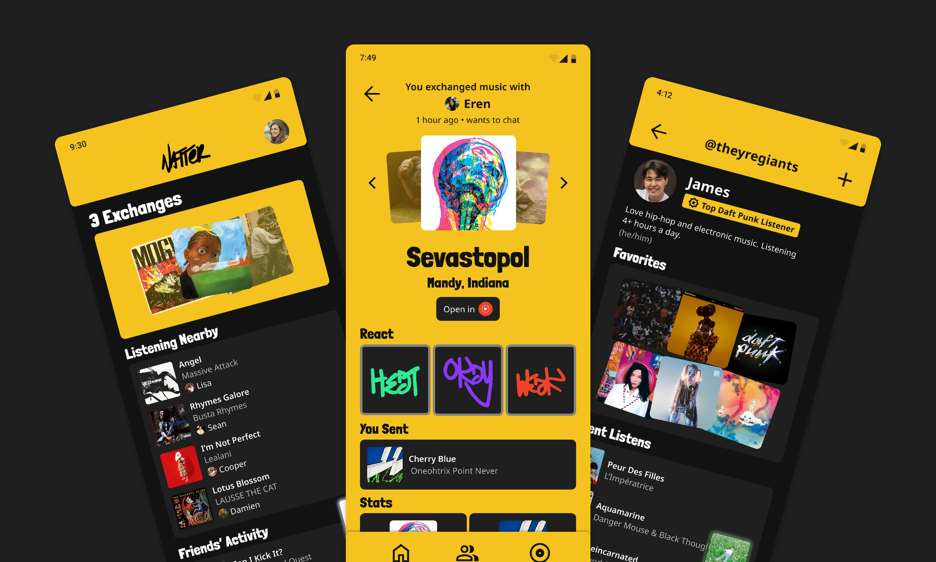
Natter is a social music experience focused on creating local connections and music discovery. Automatically share the details of music you're listening to with passerby, to create new connections and fall in love with new music.
The Problem
How can a mobile app create local connections through music?Research indicates that Americans are making fewer friends and spending less time with their friends as a whole in recent years. But it also indicates how music can be a powerful tool for connection, and I want to harness that power and present an app design that resonates with young people to encourage making new friends and sharing music.
The Solution
In 2011, Nintendo released the 3DS handheld gaming console. It had a feature that allowed nearby 3DS systems to connect wirelessly and share data such as your name, favorite game, and a greeting, as well as play games using the avatars of passerby. This concept has been hardly explored and I referenced it for my solution after reading how its users were able to connect first digitally and then in the real world.Natter would allow users to share the music they're currently listening to with nearby users. It's goal is to give users the opportunity to connect face-to-face if they're interested in the music another person shares with them.In essence, it's a band shirt for your phone.
The Identity
Natter is about being bold and showcasing one's personality. The identity centers around graffiti and tagging, which are forms of expression and community. As such, type and colors are bold, loud, and expressive.
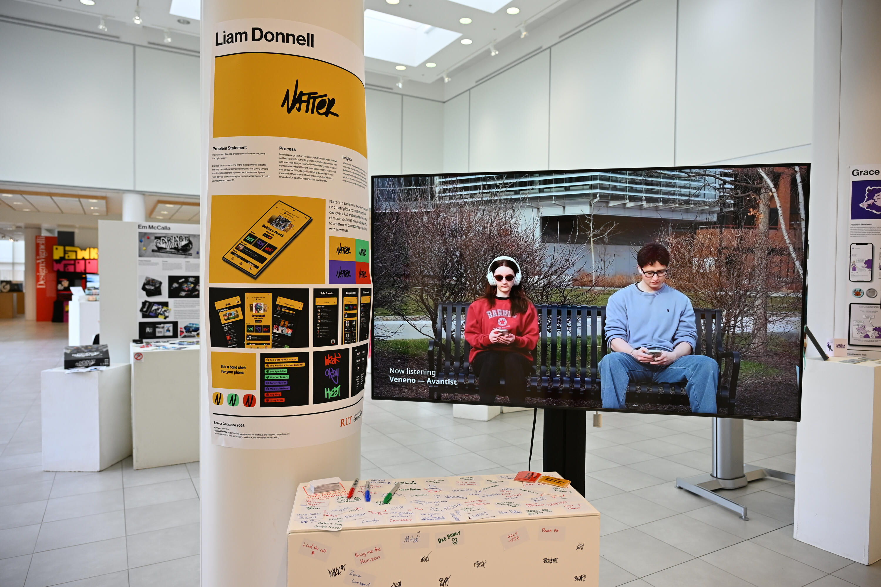
The Show
This was my RIT capstone project, which required an exhibit at the University Gallery. For my exhibit, I created a pedestal with blank stickers and markers encouraging visitors to write and share music they've been listening to.Thank you Keli DiRisio for the photograph.

Hi, I'm Liam Donnell, a graphic designer studying at Rochester Institute of Technology in New York.